MyT
Overview
To create a more personalized and informed navigation experience for riders who use the Massachusetts Bay Transportation Authority (MBTA), I designed MyT, a mobile-based application that guides passengers and allows users to create/save routes and customize them to their liking (set reminders to leave, route names, etc.).
To create a more personalized and informed navigation experience for riders who use the Massachusetts Bay Transportation Authority (MBTA), I designed MyT, a mobile-based application that guides passengers and allows users to create/save routes and customize them to their liking (set reminders to leave, route names, etc.).
Type
UI/UX, Mobile Application Design
Tools
Figma
UI/UX, Mobile Application Design
Tools
Figma
Contextual Research
To learn more about the role of design in public transportation, a couple of my fellow classmates and I conducted contextual research.


User Research - Human Behavior on the T
I observed human behavior on the T to gauge more of people’s habitual tendencies and actions they perform in a public transportation environment.
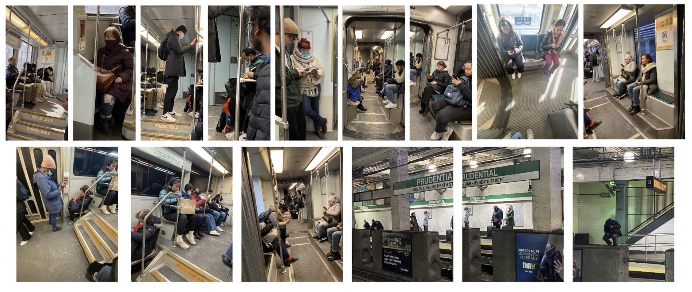
User Research - Observations
My classmates and I listed our specific observations of human behavior.


User Research - How Might We...
User Research - How Might We...
Then, my classmates and I brainstormed general “How might we...” questions that we separated into topics of navigation, public space, accessibility, etc.
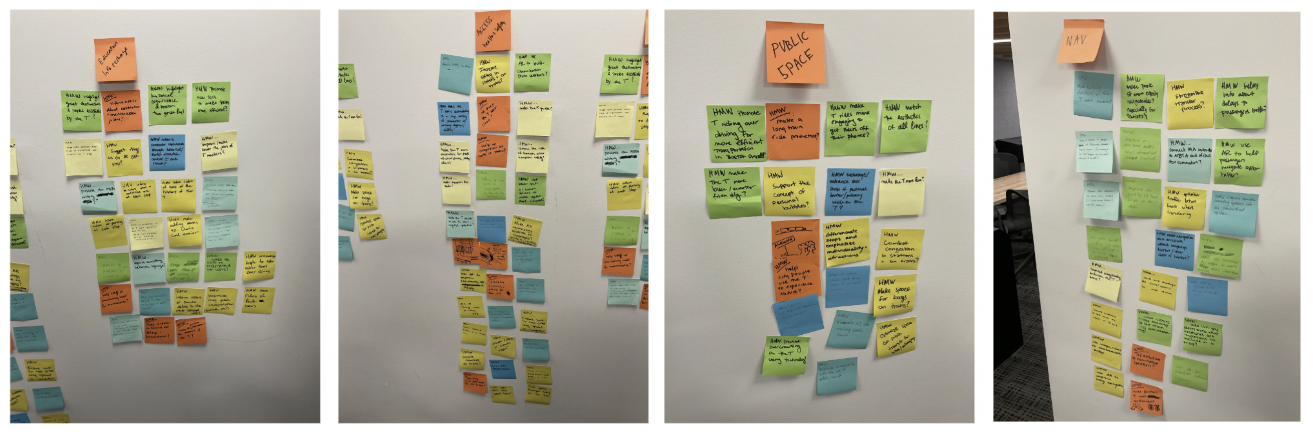
User Research - Themes
User Research - Themes
I categorized “T rider” actions into themes that I wanted to explore more.


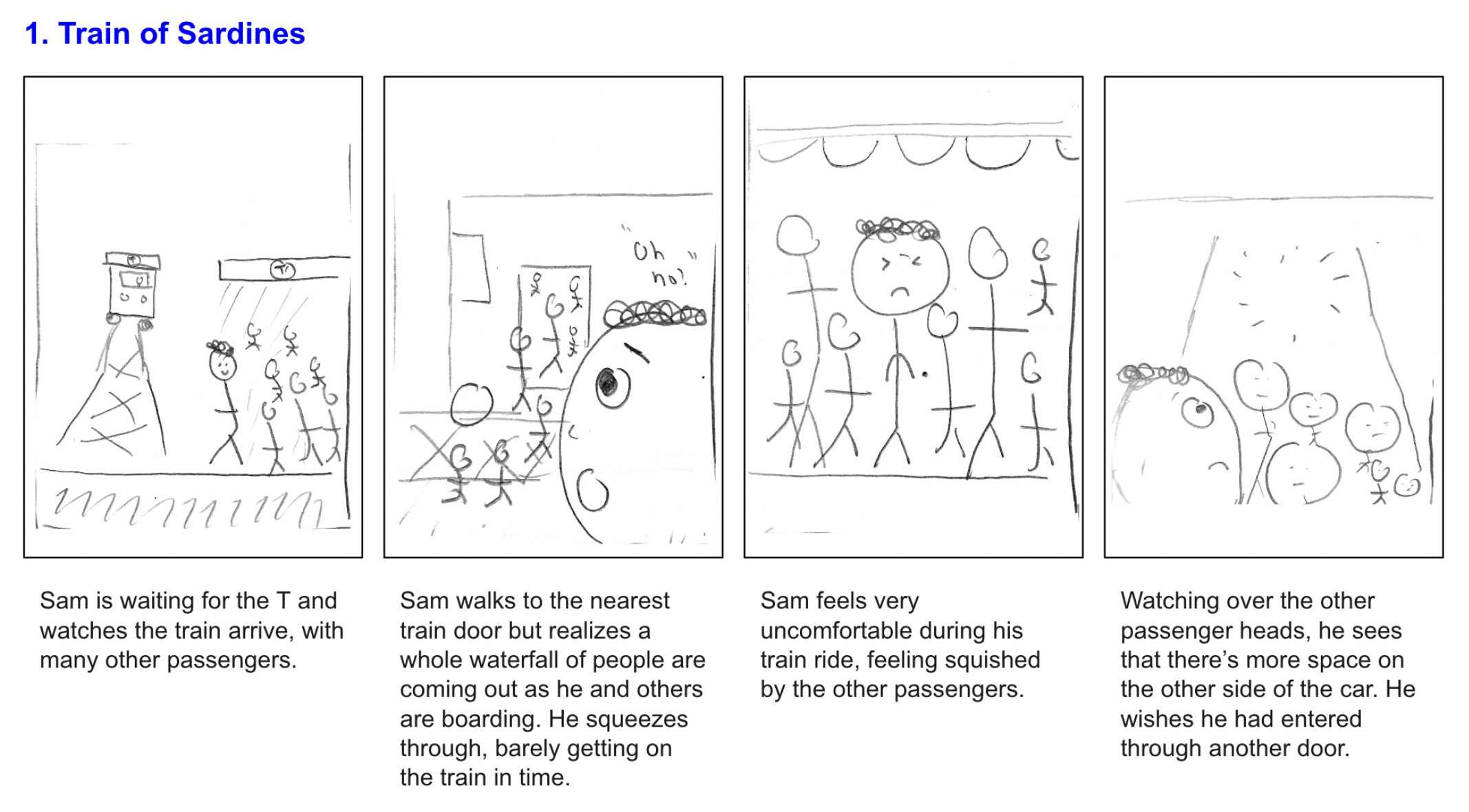
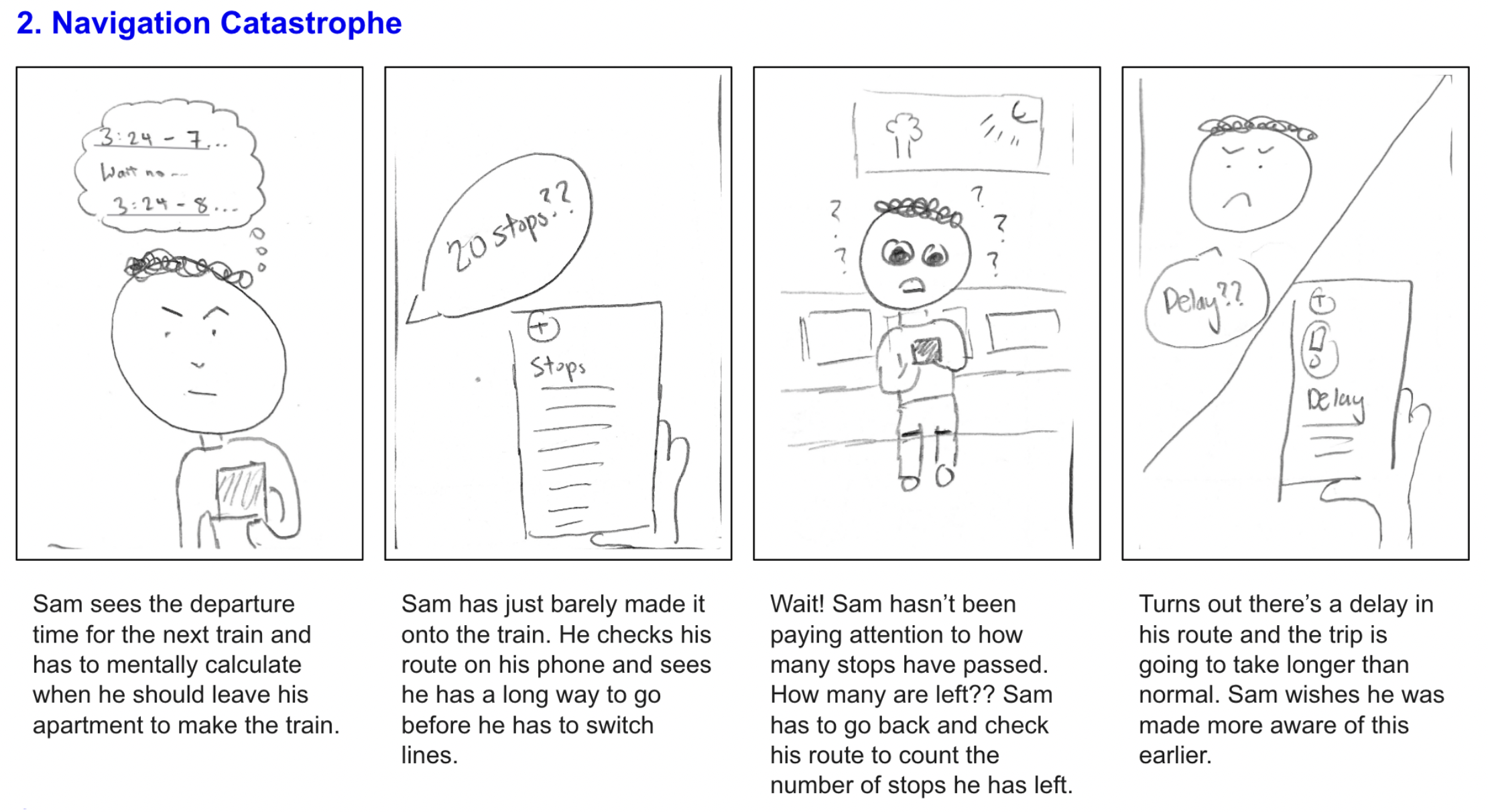
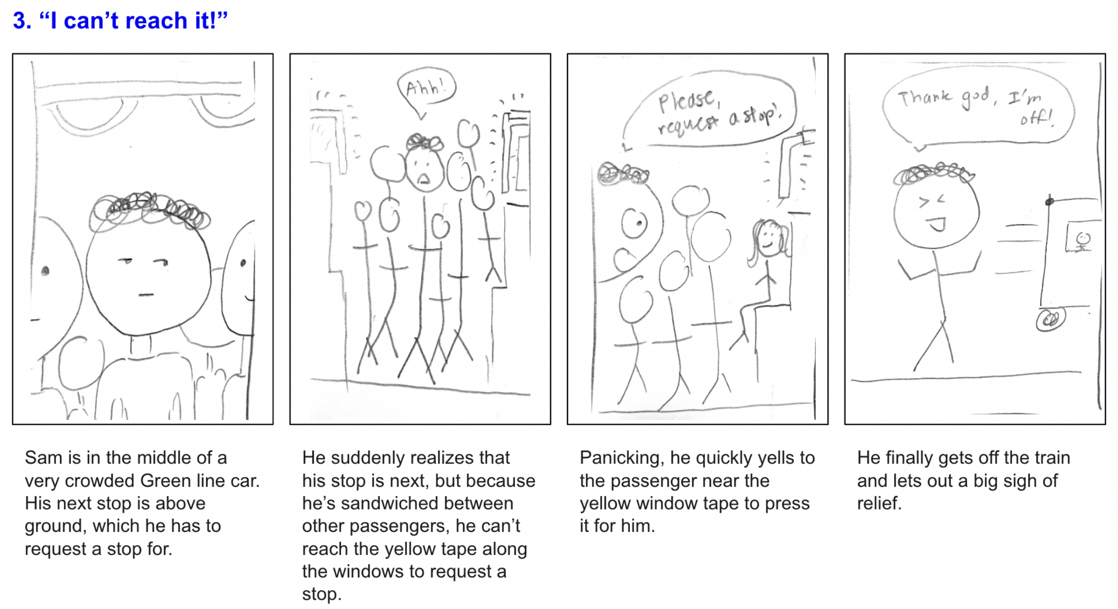
User Research - Scenarios
I created three scenarios in which passengers faced common challenges while riding the T.
Brainstorming
Brainstorming
Brainstorming
In an effort to synthesize my ideas, I brainstormed both digital and non-digital interactions that train riders can experience and benefit from, in relation to the three scenarios above.

Ideating Solutions
Ideating Solutions
Ideating Solutions
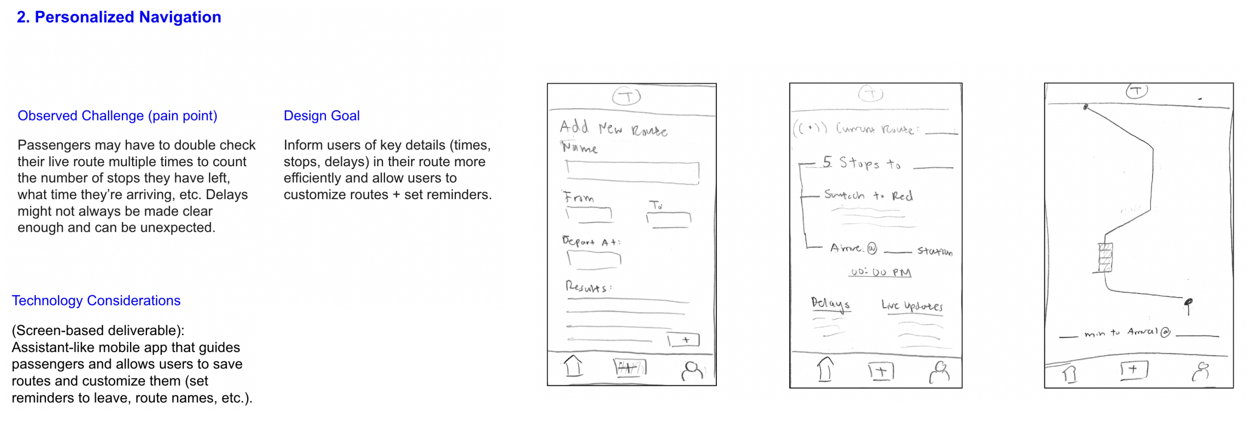
I ideated three proposals for a digital solution that would improve the experience of riding the T, as well as roughly sketched a couple of pages for the interface.
Improved passenger comfort and space:


Personalized navigation:

Accessible passenger-driver communication:


Competitive Usability Audits
Competitive Usability Audits
Competitive Usability Audits
I conducted competitve usability audits for each of my three proposed solutions, analyzing popular transportation apps. I used Nielsen’s 10 Usability Heuristics for Interface Design as a guide.
(notes are written in the colored post-its)
(notes are written in the colored post-its)
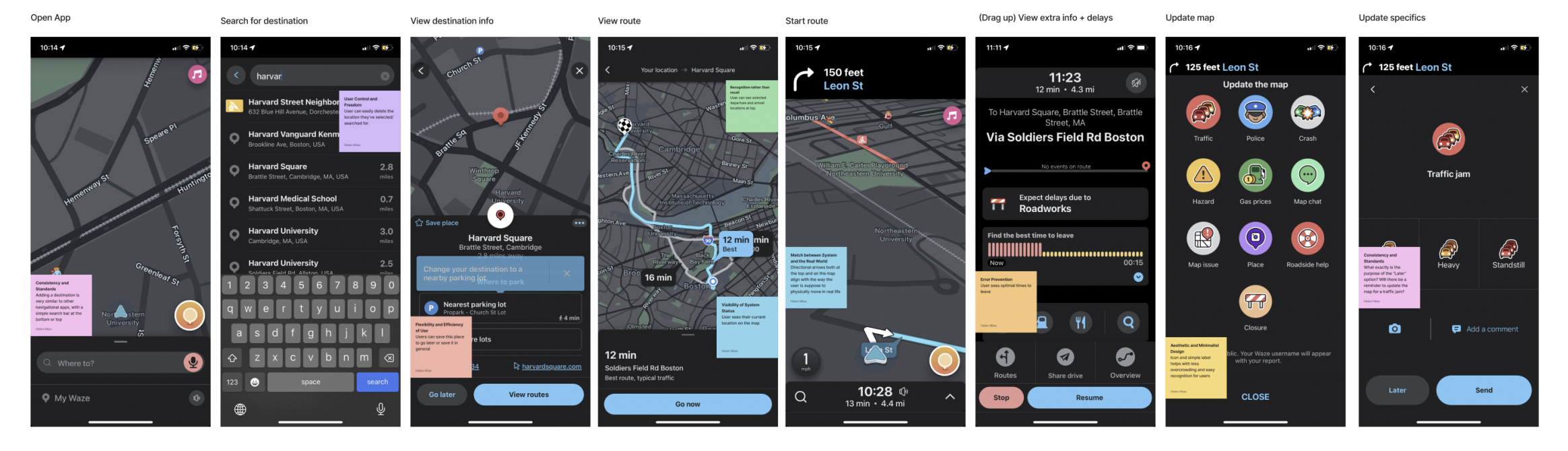
Google Maps:
Goal - Viewing a route’s information
![]()
Goal - Viewing a route’s information
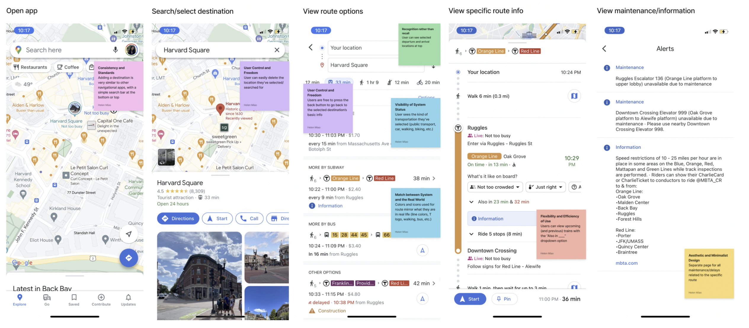
Key takeaways -
- Maintain match between system and real world
- Use colors, icons, logos, etc. that align with ones in real life
- Helps with wayfinding and recognition
- Allow for user control and freedom
- Users should be able to explore various destinations, departures, times, etc.
- Pain points in the UI:
- Needs distinguishing between kinds of alerts
- Could information be organized better in the route overview?
Waze:
Goal - Viewing delays, maintenance, information and updating map
![]()
Goal - Viewing delays, maintenance, information and updating map
Key takeaways -
- Avoid use of too many controls and buttons on one page
- Confusing for user, user feels overwhelmed
- Utilize icons and colors but not too many
- Keep departure and arrival visible at most, if not all, times
- Keep flexibility and efficiency in use
- Saving actions for later (like routes)
- Pain points in the UI:
- Alerts/delays are hidden unless user swipes up. Basically hidden
- Unclear differences between certain action button (X vs. Later)
MBTA app:
Goal - Using route Shortcuts
![]()
Goal - Using route Shortcuts
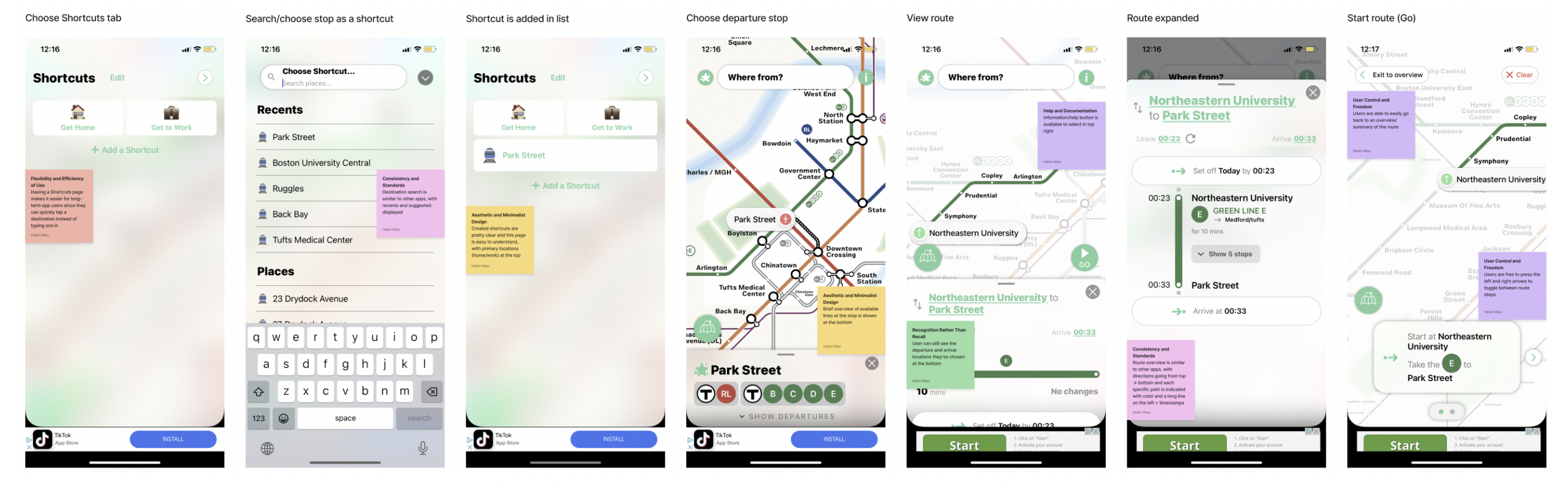
Key takeaways -
- Utilize minimalistic and clean design for route overview
- Keep essential information and use clear hierarchy and layout
- Consider separate page for shortcuts and saved routes
- Easily accessible, separate from other functions
- Pain points in the UI:
- Departure and arrival icons not very intuitive
- Inconsistent use of icons vs. emojis
- Refresh icon for Leave is unclear. What exactly is that supposed to do?
Persona
Persona
I decided to move forward with my second idea, Personalized Navigation. As a reminder, here was my proposal:
![]()
I created a persona, Michael, who would serve as a representation of my target user – T passengers that desire a more personalized digital experience with transportation that is tailored to their routes and anticipated delays:
![]()
I created a persona, Michael, who would serve as a representation of my target user – T passengers that desire a more personalized digital experience with transportation that is tailored to their routes and anticipated delays:

Sitemap
Sitemap

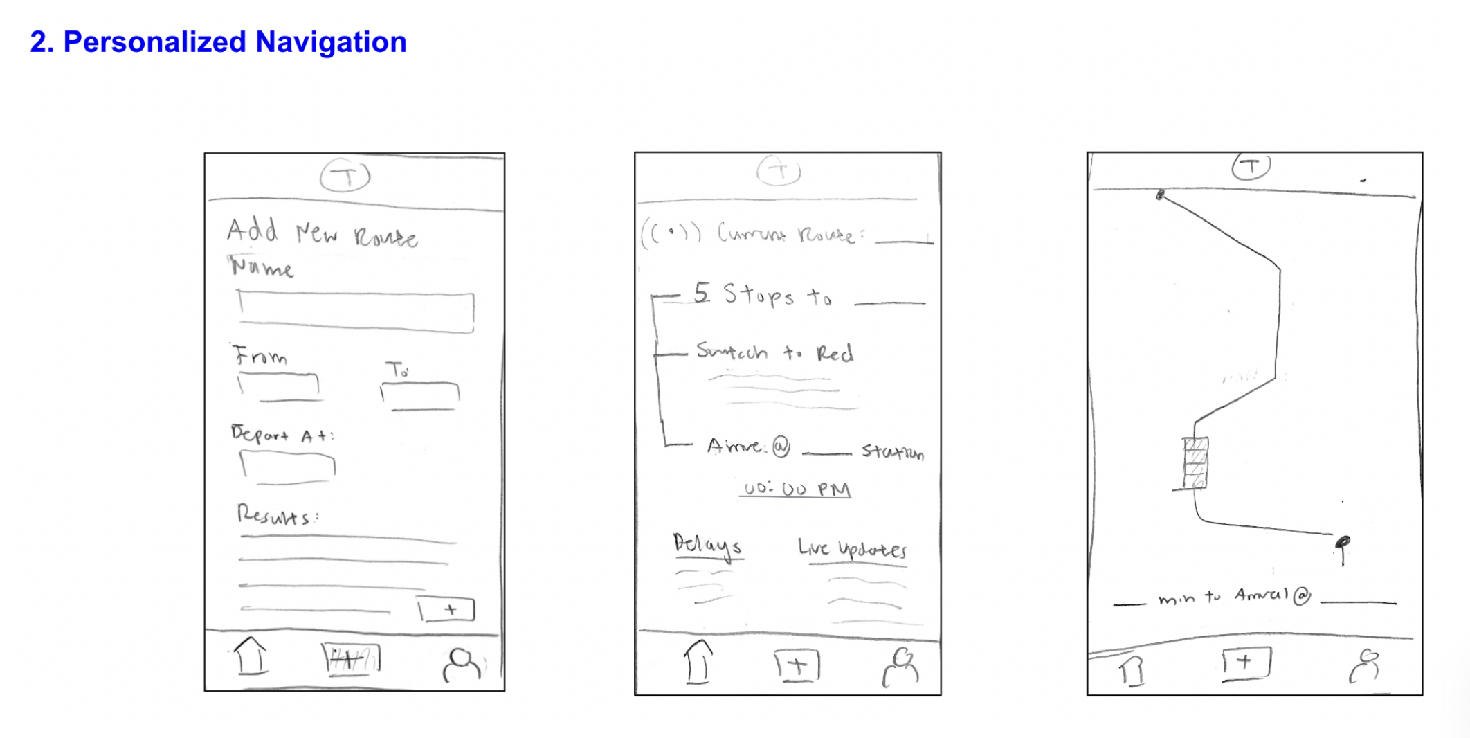
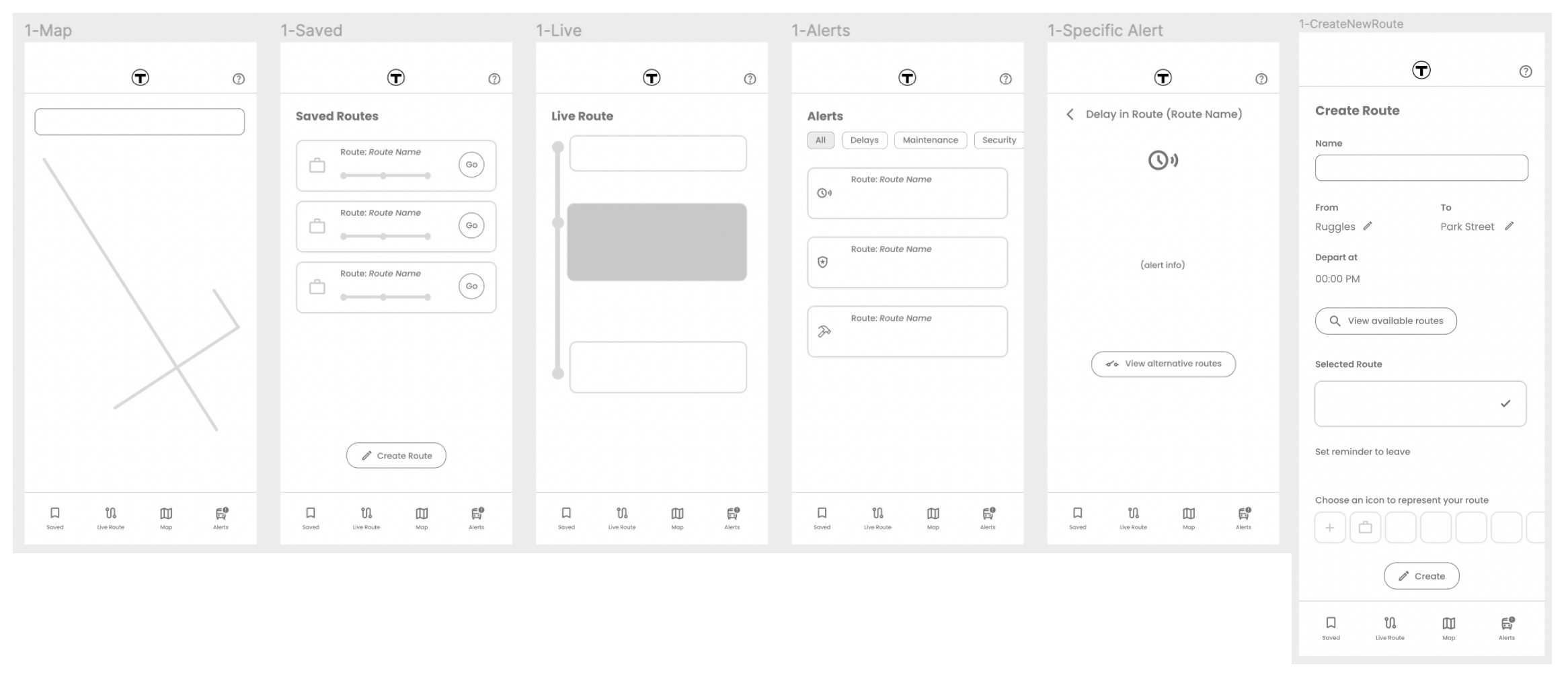
Lo-fi Wireframes V1
Lo-fi Wireframes V1
Lo-fi Wireframes V1
Lo-fi Wireframes V2
Lo-fi Wireframes V2
Lo-fi Wireframes V2

︎︎︎
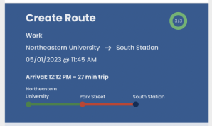
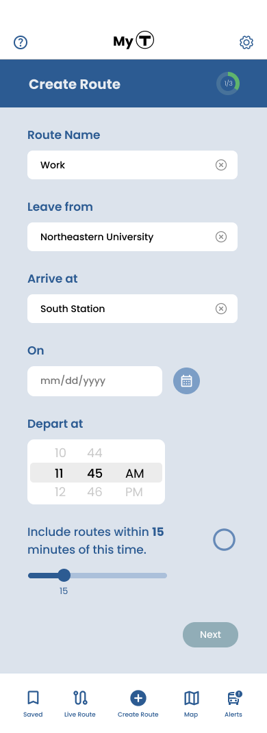
Decided to scrap having route creation on one page, so now, the user goes through route creation step-by-step
︎︎︎
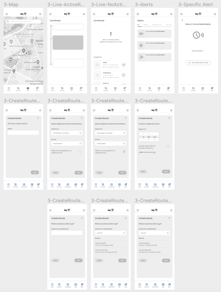
Lo-fi Wireframes V3
Lo-fi Wireframes V3
Lo-fi Wireframes V3
Created multiple iterations of the Saved Routes page:
![]()
All current wireframes side-by-side:
![]()

All current wireframes side-by-side:
Hi-fi Wireframes V1 / Experimentation
Hi-fi Wireframes V1 / Experimentation
Hi-fi Wireframes V1 / Experimentation
I experimented with colors in my first hi-fi iteration:
![]()
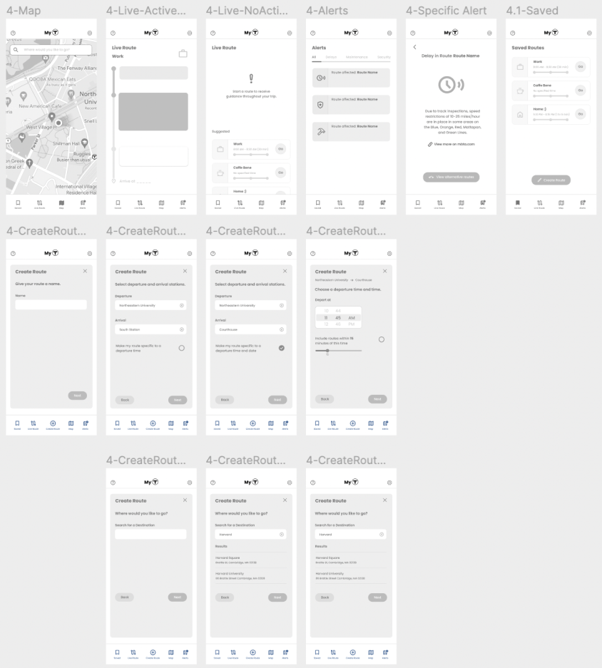
Hi-fi Wireframes V2
Hi-fi Wireframes V2
Hi-fi Wireframes V2
In my second iteration, I fleshed out the rest of the app’s pages:
![]()
User Testing
User Testing
User Testing
After testing with my target users and T riders, I received helpful feedback that affected my design decisions moving forward:

Color contrast is too low
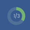
Progress bar is very effective

Awkward color usage to indicate disabled/future
Font size is too small
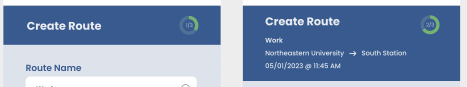
Should keep Create Route header the same across all steps. don’t merge the blue into the route details.
![]()
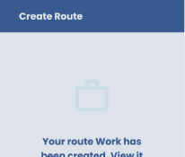
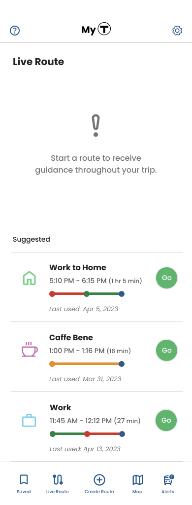
No “Go” option after creating a route

No “Go” option after creating a route
Aside from the above critique, I learned from testing that the interface was overall designed cleanly and easy to understand.
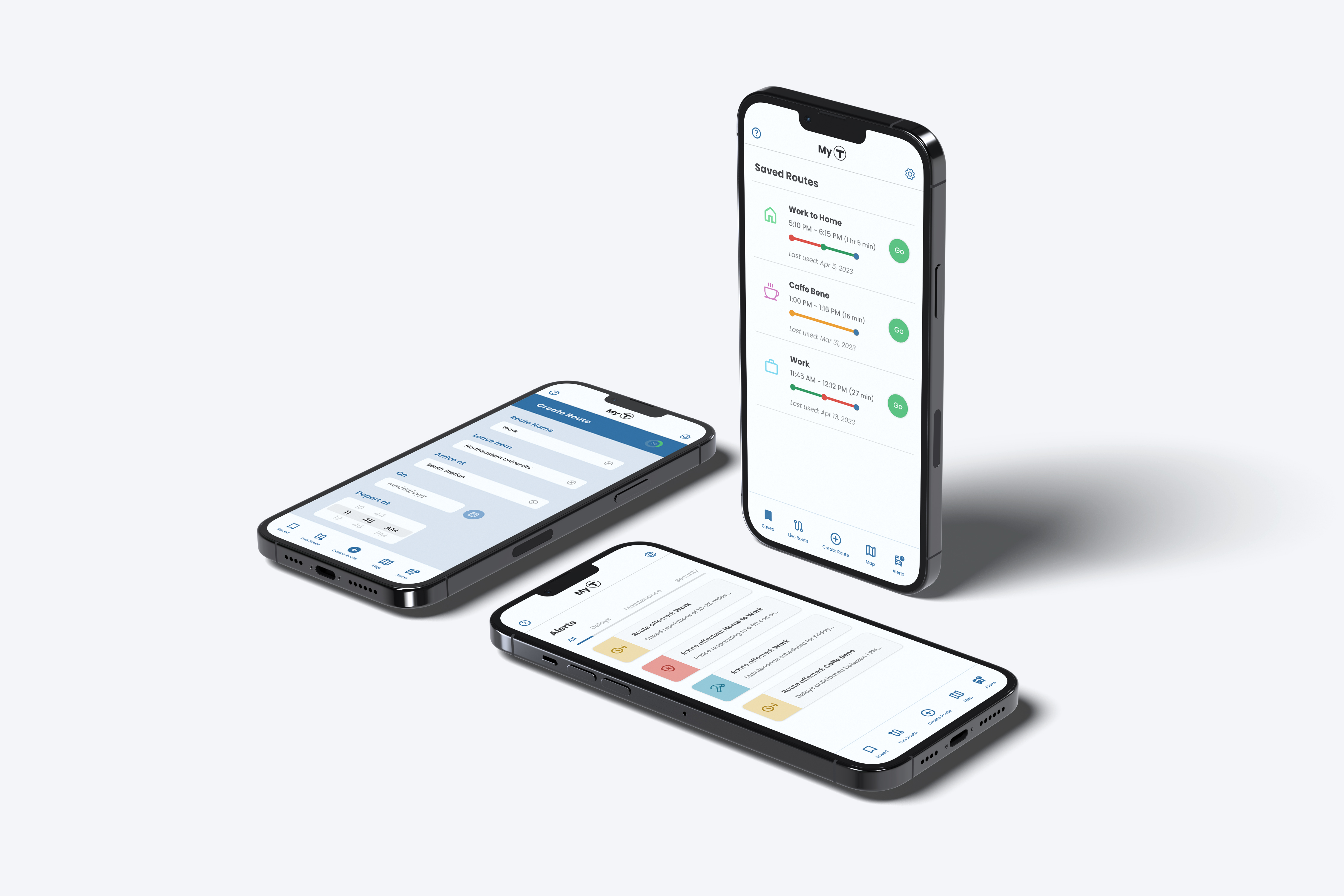
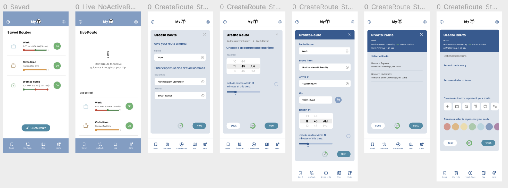
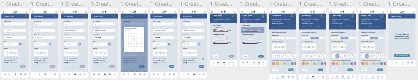
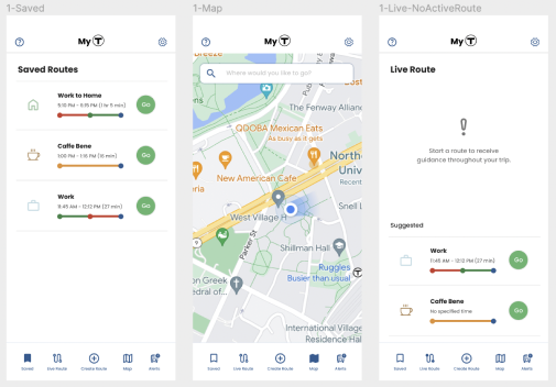
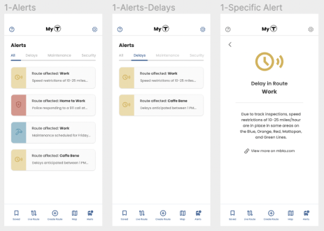
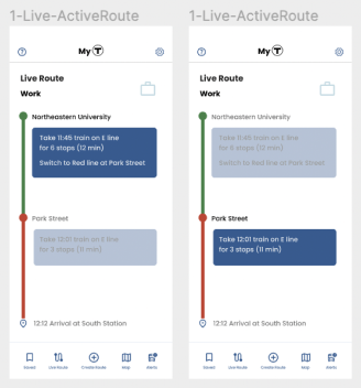
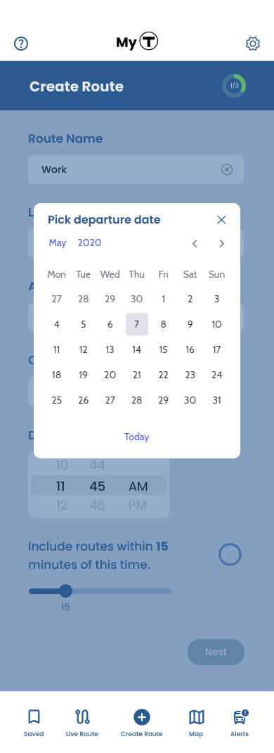
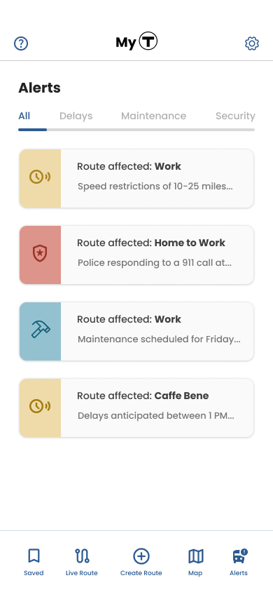
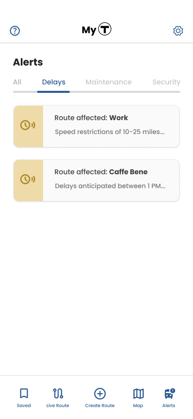
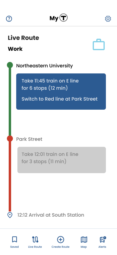
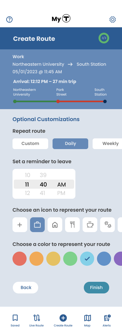
Final Hi-fi Wireframes:
Final Hi-fi Wireframes:
Final Hi-fi Wireframes:


Overlay design
Hi-fi Prototype & Demo
Hi-fi Prototype & Demo
Hi-fi Prototype & Demo
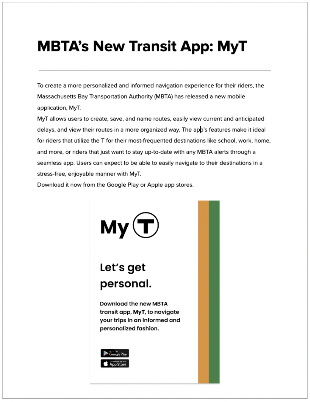
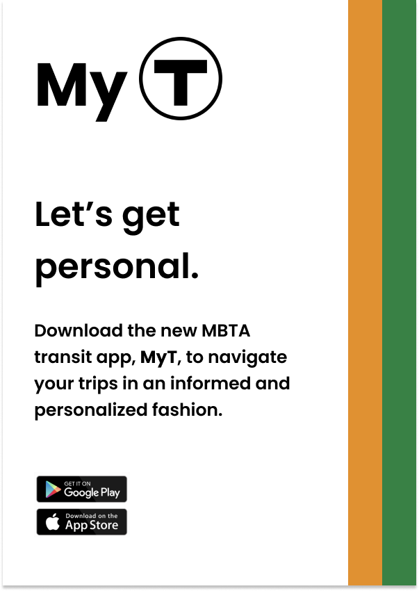
Press Release & Poster Mockups
Press Release & Poster Mockups
I mocked up a future press release and posters for my app idea, MyT:

Main Takeaways
Main Takeaways
Main Takeaways
- From this project, I learned a lot about how to maintain consistency throughout the UI. Especially with creating the design system from scratch, it’s important to not go too overboard with types of UI elements like toggles, selectors, date/time pickers, etc. Picking a smaller set of colors to work with for your buttons and indicators also helps with less visual overload for the user.
- With complex amounts and types of information, such as the information associated with creating a route, it’s important to consider what the user knows, doesn’t know, needs to know, etc. (e.g. user needs to enter date, time, location of departures and should know trip duration, # of stops, station names, etc). Determining what kinds of information is necessary in the app should be done through user testing, so you can get a better understanding of how your target users can benefit from using your application.
- It’s also important to keep your app interconnected with itself. For example, users would benefit from having the “Go” option available right after they create a new route. Providing these kinds of shortcuts not only makes the app easier to use, but also shortens the amount of time users need to complete tasks (thus improving user experience). It encourages users to use different features throughout the app. In addition, this idea is especially important for apps focused on personalization – if you want users to feel like they are in control and able to customize the app to their liking, maintain consistency by adjusting information displayed throughout the app, based on their customizations (e.g. showing only delay/maintenance information that’s relevant to the user’s saved routes).