My team at NM was Illustrations. We focused on designing for the Illustrations platform, which helps field representatives create visual examples and representation of NM products.
There are two types of designs to this platform, the input and output. The input involves the user entering client data whereas the output focuses on graphics and data visualization to show how things like their client's rate of return will change over time.
What is the Presentation App?
The Presentation app is a system used by financial advisors to display Illustrations for a client.
I helped create implement these designs into Northwestern Mutual's design system library in Figma.
Specific parts I helped update:
- Grid view: Edit and View actions on Thumbnails
- Both views: Top bar allowing users to switch between Slide, Grid, and Row view.
- Both views: Wording for current tab on side navigation
In addition, I improved their Figma component to use more nested components, as well as a wrap auto-layout instead of nested auto-layout rows.
I was responsible for creating some modal designs that are triggered when the user clicks the edit icon button on a thumbnail.
Here are a couple:

Benefits and Values modal
Click
here to view a slide presentation of my final project.
If you'd like to learn about my project in more detail, keep scrolling!
I worked with two systems:
- Planning Experience Platform - this helps financial representatives take client and product information and build a plan for their client - it allows them do things like outline the client's goals, figure out how much insurance they need, etc.
- Illustrations Platform - helps Financial Reps create visual examples/representations of NM products, and gets more realistic and specific with numbers.
These platforms are usually used by FRs one after the other.
Both tools involve a UI where the FR enters in client information and chooses NM products to illustrate or plan for. Then Output pages are created for both the FR and client to view.
UI is where the FR enters client information through inputs in Plan Build area of Planning Experience. Details on income, assets, etc.
There is output for every platform - it involves a PDF of many data visualizations and breakdowns of numbers and how the client policy values will change over time.

PX and Illustrations were originally maintained on separate teams. Last year, Illustrations was recently moved to be a part of PX because of similar concept work.
This caused a lack of consistency in the UI and overall experience, as well as:
- Disjointed user experience
- User frustration
- Inconsistent use of design guidelines
How Might We...
Improve design consistency between Illustrations and PX to unify the two platforms?
Scope
Audit 2 NM products:
- Variable Universal Life Plus (VULP)
- Portfolio Deferred Income Annuity (PDIA)
Analyze
How data is:
- Inputted (workflow)
- Grouped and ordered
- Represented
- Named
Outcomes
- Highlighted differences between PX and Illustrations
- Intuitive design solutions that enhance design cohesion

This is what my project's process looked like.
I used the common double diamond diagram — basically, I followed the main phases of:
- Discovering and identifying problem areas
- Synthesizing my findings and narrowing down areas of focus
- Ideating solutions
- delivering
Discover
I did walk-throughs of PX, Illustrations, and RD with respective designers. These were essential to gain:
- Knowledge on how to navigate the platforms and what they're used for
- Access to in-development prototypes + training environments so I'm working with up-to-date designs and not proposing solutions that are already being implemented
Other important steps I did:
- Self-exploration
- Mapping out workflows, how to get from page to page, patterns I noticed
Audit
For PX, Illustrations, and RD, I analyzed QA and designs side by side and went by section
Analysis:
- what kinds of information is asked of the user between different platforms but for the same product
- discrepancies in naming and labeling
- how information is grouped, what kinds of components are being used
Synthesize
- Consolidated audit findings, narrowed scope
- I wrote broad HMWs to reframe insights into general design opportunities while not focusing on a particular solution
- I kept heuristics in mind while analyzing efficiency of data input on screen. Ex: allowing user to have the flexibility to editing in-line OR through a modal, manually entering a date or using a date picker. Ex2: consistency between design components, labeling, etc.
- Thought about: difference of interaction cost between allocating assets or getting to edit a specific section in PX vs Illustrations
IDeate
These are design opportunities that I felt were the most impactful to pursue, after getting feedback from my manager and team.

Design Iteration

After reviewing the opportunities with both PX and NGIS design team members and due to the limited timeframe of my internship:
We chose to focus on two design opportunities. Table pattern that would result in the most impact for improving the efficiency of the user for the two platforms, and a creative solution for enhancing the date input component.
- Table Pattern
- Enhanced Date Input
Solution 1: Table PAttern
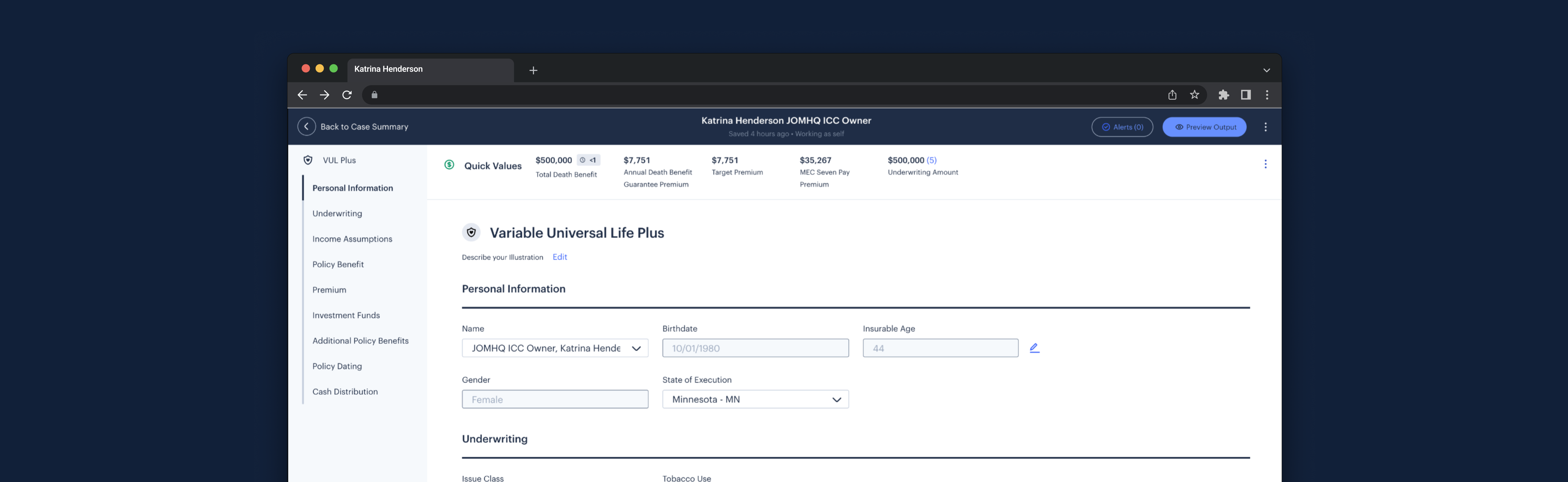
Currently on Illustrations, data inputs lie wherever they can fit on the screen.
There is a max of 4 inputs in a row.
Inputs can feel lost at a larger look of the screen, with sections blending together.

Lost, disorganized inputs
Solution:
Applying the PX Table pattern to Illustrations
Benefits:
- Data density
- Streamlined data entry
- Easier scannability
- In edit state: fit Illustrations limitation of 4 inputs per row
Prototype
This is a prototype of how the tabling pattern would work in Illustrations.
Solution 2: ENHANCED DATE INPUT
Date Enums in PX
Event enum selection allows for:
- Users to easily select a pre-determined significant event (ex. 1st to Retire, once they reach age 65)
- Reduced user effort of checking when event is
This select/text input kind of component actually isn't an official Luna component but one PX customized themselves to fit this user need of easily choosing a pre-entered event date. It is a customized PX Component that lives in PX's Community Contributions Library (CCL).
Datepicker Calendar in Illustrations
Aids with:
- Visual support
- Planning a date with context of week/month/year
-> Less cognitive load
(still allows for manual date entry)
Solution:
Enhanced Date Input
I thought — why not combine the two date functionalities and allow users to have access to both a visual guide when selecting a date and ease of selecting a pre-determined event date?
Combines:
- Visually supportive calendar
- Ease of selecting event
In addition, I expanded upon the Luna date picker to include selection between not only days, but also months and years.
Prototype
This is a prototype of how the enhanced date picker would function in both PX and Illustrations.
Next steps (both solutions)

Challenges
Onboarding to 2, almost 3 different platforms that structured their data differently
- What helped: walkthroughs, asking questions, self-exploration
Understanding use cases
- where would event enums be useful in Illustrations
- why more nested editing is needed in PX than Illustrations
- What helped: syncs with PX designers, asking questions, reading documentation
Synthesize -> Ideate Transition
- What helped: writing broad HMWs to make me not too fixated on a specific solution
- Needed to allocate more time to these phases
T
Leverage strengths of existing design
patterns
Design solutions don't have to be completely novel and super out-of-the-box. You want your design to be technically feasible and, align with the design system, and non-intrusive to what the user is already used to.
Clear documentation and communication go a long way
- seeing clear documentation like of how a component functions (ex - the PX event enums helped me understand more about its use and edge cases)
- it's important to keep your work laid out in a way that's digestible to others as it will be viewed by people u may or may not work with regularly and could be a reference point in the future
(for audits - keeps you credible) - When in doubt about designs or reasoning for why things are the way they are, connect with people - they'll explain and give better context or point you in the right direction
Consistency is key
This was the ultimate goal of my final project but can be applied anywhere - It's essential for designs to not only be intuitive, but also consistent. FRs are able to do their work more easily and serve our clients when the tools we build have seamless user experiences - ensuring that our users are not slowed down by inconsistent design patterns or confusion on where/how to input a piece of info is part of thisDesign consistency not only benefits FRs, but also us NM designers. More alignment on design guidelines that our teams follow lessens any future disconnect between designers.


