JFK Airport Site
Spearheading the design of a dashboard for NYC’s JFK Terminal Airport!
1 UI/UX Designer and Web Developer (me!)
1 UI/UX Designer
1 Senior Web Developer
1 Creative Director
Timeline
October - November 2024 (2 months)
Tools
PHP, JavaScript, CSS, WordPress, Figma
New York City's John F. Kennedy Airport Terminal 4 has been a longtime client of Ronik's. Ronik designed, developed, and maintains a new website for them that guide customers while reflecting the terminal’s warm, helpful personality, and vibrant, delightful visual branding.

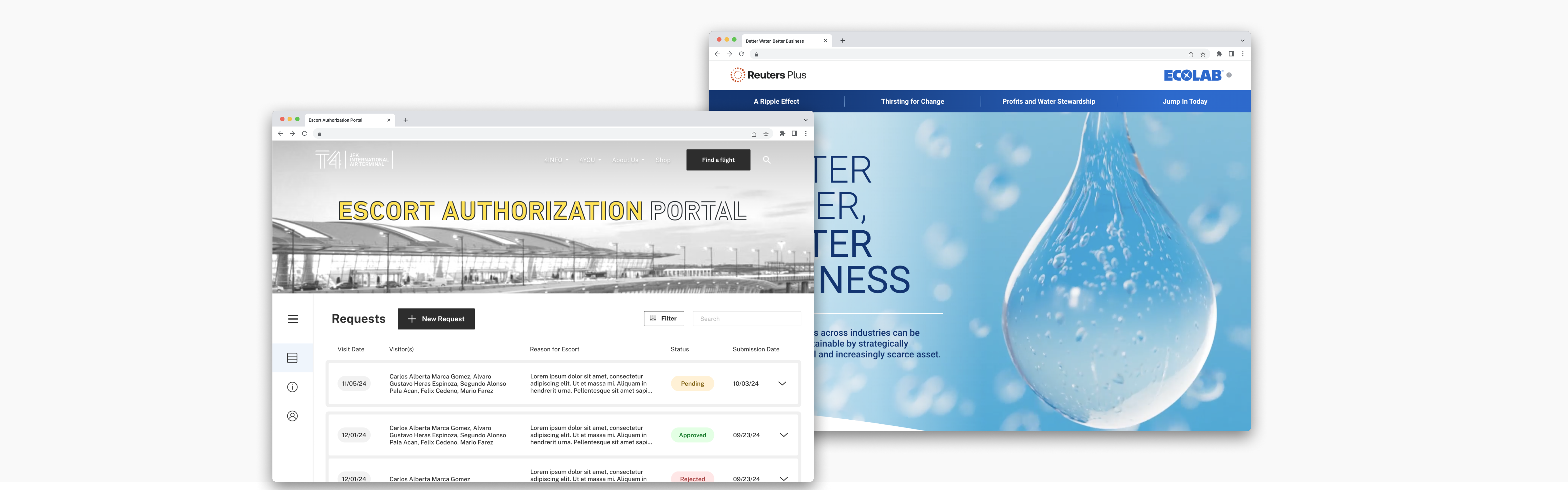
On the internal side of this site, there is a Vetting site, where the Escort Authorization Portal lives.
Here, users (businesses, mainly) submit requests for their employees to get gate passes for the terminal. T4 security employees review the requests and either approve or reject them.

GOAL
Create a dashboard for business users to login and view their recently submitted gate pass requests.
Requirements:
- Styled/branded and intuitively designed dashboard for business vendors, initial landing on successful login
- Displays user’s submissions no older than 120 days
- Sort and filter features according to fields: Request status, Visitor name, Reason for visit, Submission date, Request date
- Submissions expandable by accordion within single dashboard page
- Displays Visitor and other field info, account details, terminal info, etc.
In Design Round 1, I used the existing design system to experiment with a few different dashboard layouts.
Some select designs:
Using feedback, I focused on a side navigation bar moving forward:
However, a need for more functionality arose — quite often, submissions can be grouped together.
A submission might be split into multiple submissions, if a subset of visitors in the request was more quickly approved or rejected while the other visitors are still pending or have a different status.
To address this, I created designs that involved grouped submissions:
In addition, I began iterating on what filters could look like:
Next, I explored what it would look like if the accordion for a form submission was open, as well as a state for filters applied and a new Past Requests header to show archived requests.
My designs were sent to the client, JFK, to be reviewed and approved.
In R2, the main goal was to flesh out designs for the rest of the pages, other edge cases, and mobile designs.
Here are the rest of the other pages and edge cases I designed:
Some of my mobile designs:
In addition to designing the end-to-end UX of the vetting dashboard, I also helped develop the site and clean up various animations! Our tech stack involved JavaScript, PHP, HTML, and CSS.
Here's a demo of the final live site! This was launched in December of 2024.
Reuters x Ecolab
Working with a leading news agency and chemicals company to address the impact of water on energy and greenhouse gas emissions in an engaging web page.
2 UI/UX Designers (including me!)
1 Creative Director
Timeline
August - November 2024
Thomson Reuters is a multinational company that provides information, technology, and software solutions to professionals and businesses across various industries, including legal, tax and accounting, news and media, risk, and finance. We worked with their news sector,
Reuters.
Ecolab is a global leader in water, hygiene, and energy technologies and services, focused on helping organizations operate efficiently and sustainably. You may have seen their products in many spaces, such as homes, public restrooms, kitchens, etc.
Ronik teamed with Reuters and EcoLab to create a webpage design that advocated for EcoLab's new Ecolab Water for Climate™ program, helping businesses optimize their water usage and act more profitable and sustainable.
GOAL
Create a visually captivating webpage to spotlight EcoLab's new sustainability program, highlighting its benefits and illustrating the direct impact of water usage on industrial production.
The other UI/UX Design intern and I initially tackled separate explorations on the designs.
All we were given included a document that had text content of what had to be displayed on the webpage, as well as EcoLab's brand guidelines:
Here was some of my initial design exploration and rough sketches:
Refining my direction, I continued iterating on each of the chapter designs. I received feedback to make my designs feel more dynamic, play around more with the headers, use more varying image crops, and tie up the spacing between elements.
Here was my next round of designs:
For Design R2, the client chose my designs to move forward with, with some tweaks.
Here are the desktop and mobile designs I delivered:
However, the client asked for some changes to be made — they wanted to remove most images from the design and focus more on the text content, while still maintaining the visual language of elements like the icons. A fellow design intern helped make these modifications.
Here are the final desktop and mobile designs:
Flo Marketing Rebrand
Completely revamping another creative agency's brand and design system to reflects a more mature brand that is focused on strategy and branding, evoking its brand philosophy and personality.
3 UI/UX Designers (including me!)
2 Creative Directors
Timeline
October 2024 - December 2024
Leading Edge Team Page Redesign
Redesigning a team page to improve organization and clarity, and spicing it up!
2 UI/UX Designers (including me!)
1 Creative Director
1 Web Developer
Timeline
November - December 2024
Leading Edge is an organization that strengthens workplace culture and leadership in Jewish nonprofits to help them achieve their missions.
Their current Team page:
Initial client requirements:
- A "Leadership" section at the top that displays the largest entries, around 2 per row on desktop. Client no longer wants to list everyone together in one alphabetical wall of entries.
- Department sections: Break the rest of the main "team" section into departments, with the CMS ability on the client's end to change/rename/add/subtract/reorder how many departments there are as time goes by. It's now a lot to scroll though.
- In the main team section: make it so each team member entry doesn't display the "organization" field.
For board members, even smaller entries — five per row on desktop, now that the main team section will have four. - A bit more visual pizzazz overall. This is one of their most frequently visited pages.
The other intern and I explored designs on our own first. I experimented with the text hierarchy, hover states, more imagery, and implemented the client's asks.
Just a few of my iterations:
For the next round of designs, the client wanted small tweaks such as 3 images per row instead in the Leadership section. We also created the alternative view where the staff are not separated into departments. The other intern and I worked together to product this final round of design:
With dept. sections - Desktop
Without dept. sections - Desktop
With dept. sections - Desktop
Without dept. sections - Mobile


View the live, updated site
here!
Miscellaneous Work
Extra designs I completed when there were slower days :)
Another client of Ronik's is NBCUniversal. I completed a new call-to-action and flow for users to log in to the
NBCUniversal Together site.
Current state:
- No way to see that someone is logged in.
- The Footer has an “Account Settings” link under YOUR NBCU, and if you click and aren’t logged in, it will prompt you to log in. If you are logged in, it will show you your account settings.
- No login button easily accessible.
My solution was to add a Login or Account button to the nav bar:
New login flow: